Incidental Colour in Colour Harmony Design
By Elizabeth Konig
Incidental Colour Definition: "Subordinate colour that occurs naturally in plant materials; e.g. calyx, centers, stems." Flair
The use of incidental colour in most designing is acceptable, however when a schedule asks for a design to be in a specific colour harmony, or an examination piece is based on a specific colour harmony, the designer would need to consider just how much incidental colour is acceptable.
Care should be exercised when choosing flowers and other plant materials for these designs, and the following are just some considerations that should be observed.
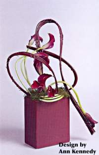
A feature of grouped Calla stems in a contemporary monochromatic design based on the hue, red, would be down pointed under 'expression and suitability' by the judging panel.
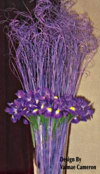
The yellow luminous markings on a blue Iris could also be a distraction if they were used in a monochromatic design based on the hue blue.
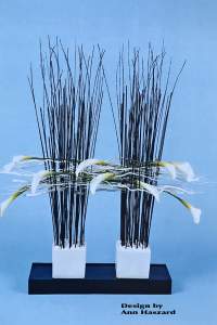
In an Achromatic design, care should be taken to ensure that green stems do not dominate within the design.