The Use of Yellow-Green in Floral Design
By Fay Edgecombe
Do you know where yellow-green is situated on the colour wheel?
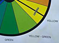
Naturally, it sits between green and yellow. So when we talk about yellow green we can visualise that the colour is half green and half yellow. Because yellow- green contains elements of the colours it sits next to, it makes a visually pleasing combination. This also applies to the other tertiary and secondary colours around the colour wheel.
Some people may call this colour ‘lime green’ and you will have observed in the garden and in interior design, that yellow-green brings a breath of freshness and energy. Yellow-green also reminds us of Spring as the leaves that first appear on many plants are a yellow-green becoming greener as they age and produce more chlorophyll.Yellow-green appears to be a warmer rather than cooler because of the addition of yellow.
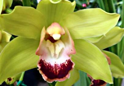
Lying opposite yellow-green on the colour wheel is red-violet. These two therefore are direct complements and many of you would agree that this is one of the most stunning of the direct complements. Yellow-green and red-violet when being used together also look better as pure hues rather than with some dilution as they seem to give each other vitality. Nature has provided us with this very combination in cymbidium orchids.
How then do we use yellow-green in our designing?
When designing with colour and in this instance yellow-green, the following principles of design apply:
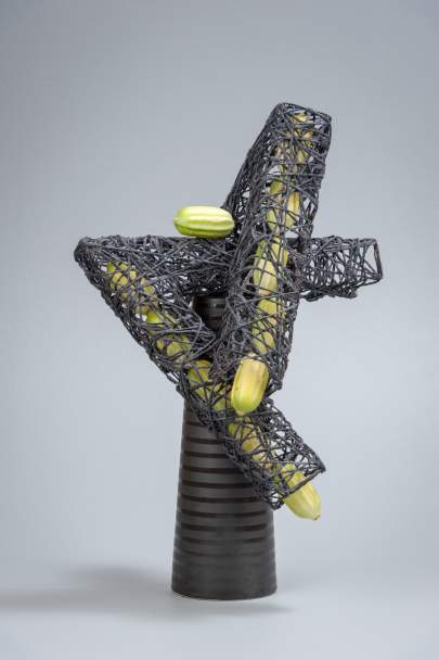
Design by Annette Waller
•Colour balance is an important principle and good colour balance depends on a correct distribution of visual weight so that the two sides of the design appear equally balanced in colour. A small area of bright colour on one side of the vertical axis will balance a large area of weaker colour on the other side. Balance is also helped by placing bright colours low and weaker colours higher and on the edges. Using colours which clash with each other, having a jarring effect on the viewer can be inspiring and exciting. However as there are very few colours which do not work with yellow-green this may be harder to achieve.

More – – – Less – – Least
•Colour proportion is a key principle and it is not advisable to have equal amounts of the colours used. A good guide if there are three hues, is to have MORE of one, LESS of another and LEAST of the third. In this case too much yellow-green could appear quite harsh depending on its strength and the strength of the other hues. Contrasting colours tend to be more successful in smaller amounts.
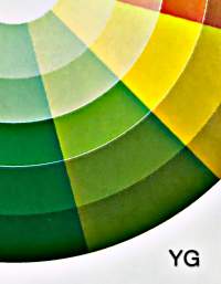
•Colour Rhythm is important. Related movement in colour can be obtained by using a gradation of values of the dominant colour. If yellow-green is to be the dominant colour then have a look at the Colour Wheel published inside the back cover of FASNZ Reference Book, Flair, you will see good examples of the gradation of yellow-green.
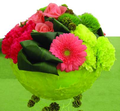
•Colour Unity is helped by colour repetition and variety to give interest and it is important to remember that the container is part of the overall unity of the design. A yellow-green container can be very stunning as in this design by Francine Thomas.
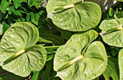
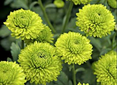
• Colour and Texture also play a big part in the use yellow-green and if we think of the contrast of the shininess of a Midori anthurium and the roughness of a button chrysanthemum or the silkiness of one of the new yellow green roses with a yellow-green carnation we can create some inspiring pieces. As well as flowers there are many yellow–green foliages. e.g. Choysia tenata Sundance, Heuchera x villosa Citronelle, and various Hostas.
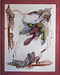
Design by Linda Barnett
•Colour and Accent: Yellow-green as an accent will add life to any colour combination that is possibly a little lifeless and boring and this may be what is needed to make it gel. It may also change the design from ordinary to very special.
Have fun experimenting with this very versatile colour!


