Gradation of Colour for Traditional Designing
By Linda Barnett
We are always hearing about gradation of colour as a Characteristic for Traditional Designs and yet it is often the characteristic hardest to achieve.
Characteristics of Traditional Designs: “... A gradual change is size, weight, texture, grouping, colour or form.” – Flair
What is gradation of colour?
(As discussed in a previous posting regarding the Dimension of Colour.)
Value is the Dimension of Colour which refers to, “The graded scale of lightness or darkness of a colour, measured in relation to a graded scale from black to white. It is the modification of a hue shown in tints, tones and shades by the addition of black, grey and white.” Flair
Chroma is also a Dimension of Colour which refers to, “The intensity of colour. The range extends from extreme dilution to full strength saturation.” Flair
Tints, tones, and shades and weak and strong chroma of a hue sounds simple but finding the correct plant material to achieve this can be quite difficult and is a must for a good a Traditional Design.
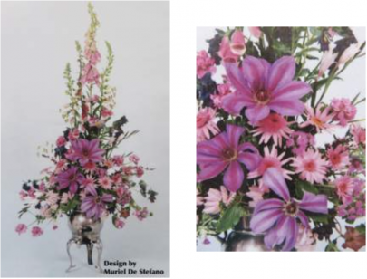
In this example the shades and tones are in the Clematis flowers. The daisies and Digitalis are tones and tints. The Erica is a weaker tint; i.e. less chroma. Plant material has been chosen well to achieve good gradation of colour. Gradation of Colour also creates rhythm through the design.
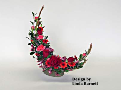
It can be very hard to use a strong red with its tints tones and shades to create a design with good colour balance. Often with the dark tone of red, the design appears to have a visual hole. As in this example, it is much easier when a less dramatic hue is chosen.
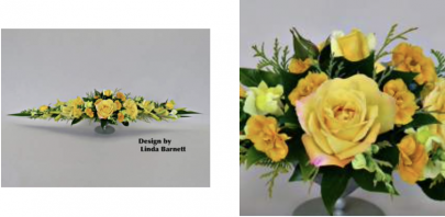
Also, depth can be achieved by placing a darker value and stronger chroma flower behind a lighter and less intense one. Thus, as in this example, a flat look has been avoided.

