Articles & Step By Step Tutorials
Learn new design styles and discover new techniques with these articles from Floral Focus magazines, and step by step tutorials.
Categories
- Step By Step Tutorials
- Colour Tutorials
- Techniques Tutorials
- Innovative Design Tutorials
- Styles Tutorials
Recent Articles


The Complexity of Colour - Dimensions of Colour
by Janthia Holt
Using colour effectively in designing will give you the edge - using colour well could make the difference between a good design and a fabulous design.
Colour is an element of design and there are many aspects of colour and a lot of confusing terminology which can sometimes make a fascinating subject tedious.
The three dimensions of colour are Hue, Value and Chroma. They are the means of describing colour and give an accurate description.
Hue:
This quality refers to the actual colour. The pure colour may be found in flowers such as red poppies and yellow daffodils. All these colours at this stage have no black, white, or grey added to them.
Value:
This is.…. The graded scale of lightness or darkness of a colour, measured in relation to a graded scale from black to white. We can change the appearance of the colour by adding white to make it lighter or black to make it darker, or by adding both black & white together - grey - to give a more dusky appearance to the colour.
Examples are:
• adding black to red to produce a maroon colour
• adding white to red to produce a pink colour
• adding grey to red to produce a dusky rose colour
* adding black to violet to give an aubergine colour
• adding grey to violet to give a dusky lilac colour
• adding white to violet produces a mauve colour.
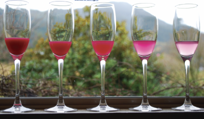
Chroma:
This is... The intensity of colour. In other words, some colours appear to contain a lot of the hue/colour such as in the first glass in the photograph, right down to a diluted version of the same colour in the last glass. Similarly, some camellias will show a full strength Chroma, they are very intensely coloured, others will look pale and washed out, they have reduced Chroma. This process may happen as a flower ages.
['Playing' with even a very basic range of paint colours (eq. red, yellow, blue, black and white) can become a fascinating activity of discovery. Why not try it, one rainy afternoon this Winter? Editor]
In this photograph the watercolour paint carmine red has been mixed with water, and then diluted successively with 50% water each time...the Chroma is reduced as the eye travels to the right.