Articles & Step By Step Tutorials
Learn new design styles and discover new techniques with these articles from Floral Focus magazines, and step by step tutorials.
Categories
- Step By Step Tutorials
- Colour Tutorials
- Techniques Tutorials
- Innovative Design Tutorials
- Styles Tutorials
Recent Articles


The Complexity of Colour - Expression and Interpretation
by Liz Chapman
You have been given a design title to interpret, so where do you start?
Possibly you will begin by researching the title and deciding what is the most important part to emphasise.
You will consider the style of design, the container or staging and the plant material you may wish to use, but equally important you will be thinking about colour.
Colour is an expressive and powerful communication tool. It tells the story; portrays a theme or title; conveys a message; creates a mood or an atmosphere. It communicates visually and can be dramatic, soothing and calm, rich, powerful or serene.
Colour is emotional; bright gay colours may make you feel happy while dull, dark colours may make you feel sad.
Colour is therapeutic and may affect health and behaviour. Pink is known to have a calming effect on prisoners, although it is most often considered feminine and romantic.
Colour is symbolic and may be tied to religious, cultural, political or social influences.
An awareness of colour meanings combined with the careful and considered use of colour will make the difference when interpreting a design title successfully. Although colour associations are personal and mean different things to different people, there are many accepted and common interpretative messages which will vary, depending on culture and circumstances.
For example:
Red indicates danger, anger, vibrancy or action, but is also frequently associated with passion and romance.
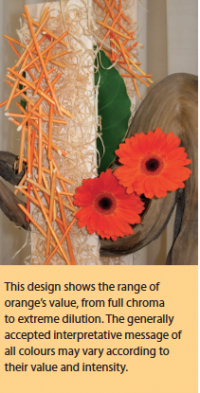
Orange is stimulating and flamboyant; It is a vital and strong colour that can be used to signify power and strength but may also imply warmth and friendliness.
Yellow is very luminous and portrays happiness, warmth, youth, wealth, but also deceit and cowardice.
Blue is associated with space, cold, cleanliness, sea, sky, peace, transparency, calm, tranquillity.
Green is considered a safe and reliable colour; if unsure what colour to use, include green in your interpretative design. It symbolises nature and the environment, growth, hope, relaxation, healing, but also jealousy.
Violet and purple are often considered as the colours of good judgement and purpose; of dignity, age, mystery, luxury, royalty, opulence and wisdom.
The achromatic colours also tell a story.
White is the colour of innocence, truth, purity and honesty.
Black. Although, black implies formality, sophistication, sorrow or drama, it may also imply inconspicuousness and obscurity.
Grey is a neutral colour that suggests security, maturity, twilight, dignity, responsibility and dependability.
'Mere colour, can speak to the soul in a thousand different ways'. Oscar Wilde