Articles & Step By Step Tutorials
Learn new design styles and discover new techniques with these articles from Floral Focus magazines, and step by step tutorials.
Categories
- Step By Step Tutorials
- Colour Tutorials
- Techniques Tutorials
- Innovative Design Tutorials
- Styles Tutorials
Recent Articles


The Complexity of Colour - Incidental Colour
Incidental Colour in a Colour Harmony Design
by Elizabeth Konig
Subordinate colour that occurs naturally in plant material, e.g. calyx, centres, stems. 'Flair'
The use of incidental colour in most designing is acceptable, however, when a schedule asks for a design to be in a specific colour harmony, or an examination piece is based on a specific colour harmony, the designer would need to consider just how much incidental colour is acceptable.
Care should be exercised when choosing flowers and other plant materials for these designs, and the following are just some considerations that should be observed.
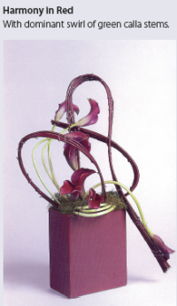
A feature of grouped calla stems in a contemporary Monochromatic design based on the hue red, would be down pointed under 'Expression and Suitability' by the judging panel.
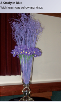
Gerbera that have a very definite yellow or lime green centre which can be very distracting and eye pulling when not in keeping with the colour harmony. The yellow luminous markings on a blue Iris could also be a distraction if they were used in a Monochromatic design based on the hue blue.
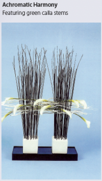
In an Achromatic design, care should be taken to ensure that green stems do not dominate within the design.
Removing the spadix from Anthuriums along with removing the flower from the Zantedeschia, can in some cases become a distraction within the design. It would be more appropriate to turn or place the flower in a different manner. Likewise, the removal of all leaves from a stem of roses, for example, the baldness of the stem becomes very obvious thus drawing the eye.
In sculptural designing the calyx of flowers such as roses and carnations are not seen, and these should be recessed and undulated to conceal the stem and calyx.
In conclusion, some incidental colour within the design is acceptable, providing that it does not dominate and distract from the overall harmony.
In each of the following examples, the Incidental colour is too dominant for the required colour harmony, and would be likely to be down pointed if Judged.